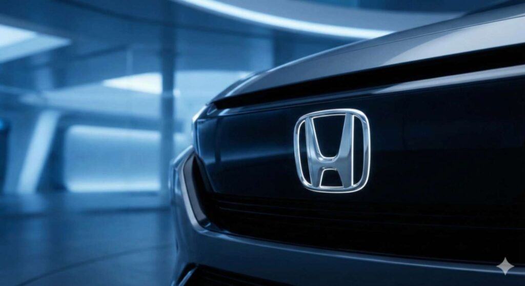
Honda’s Bold New Symbol for the Electric Era. The automotive world is witnessing a historic shift as Honda unveils a reimagined version of its iconic “H mark” logo, a change that signals a definitive step toward a fully electric future. For decades, the silver H enclosed in a box has been a symbol of reliability and engineering excellence on internal combustion engine cars, but the next generation of mobility requires a fresh identity. This new design strips away the surrounding border, allowing the sides of the letter to stretch outward like two open hands reaching toward new possibilities. It is a visual representation of the company’s commitment to expanding mobility and meeting the needs of drivers in a rapidly changing world. This thinner, more minimalist emblem pays homage to the brand’s original unsheltered design from the nineteen sixties while simultaneously looking forward to a modern, digitized age.This striking new logo is not just a cosmetic update but serves as the dedicated badge for the upcoming “Honda 0 Series” global electric vehicle lineup. The design philosophy here reflects a determination to pursue new challenges and advancements without being weighed down by the past. By removing the frame, Honda suggests that its future vehicles will break boundaries and exceed traditional limitations associated with electric cars, such as range anxiety and charging times. The “0 Series” represents a return to the starting point, a reset where the company creates new value from zero. This badge will debut on next-generation EVs, starting with the sleek Saloon concept, marking a clear distinction between their standard hybrid models and this new wave of dedicated electric architecture.As the industry races toward electrification, branding has become as crucial as battery technology in distinguishing manufacturers in a crowded market. Honda’s decision to utilize a unique emblem for its next-generation EVs highlights the importance of this specific lineup in their broader global strategy. It creates a sense of exclusivity and innovation for buyers who are ready to transition to electric driving. This “H mark” serves as a promise of transformation, ensuring that when you see those outstretched silver lines on a grille, you are looking at the pinnacle of Honda’s electric engineering and a vehicle designed with a focus on lightness, wisdom, and the pure joy of driving.
The Evolution of an Icon: Why Change Now?
For decades, the “H” inside a rounded square has represented the VTEC engines and fuel-efficient sedans we’ve grown to love. However, as Honda pivots toward its goal of 100% electric vehicle (EV) sales by 2040, the traditional badge began to feel like a relic of the gasoline age.
A Nod to the Past, a Leap to the Future
The new logo actually draws inspiration from Honda’s very first “H” logo from the 1960s. By removing the outer border and thinning the lines, the design feels:
- Open and Fluid: Representing the limitless possibilities of mobility.
- Lightweight: A subtle nod to the efficiency required for EV range.
- Extended: The top of the “H” reaches outward like two outstretched hands, symbolizing a commitment to the user experience.
Honda 0 Series: The Debut of the New Identity
You won’t see this logo on a Civic or an Accord just yet. Honda’s Bold New Symbol for the Electric Era is reserved exclusively for the next generation of EVs, starting with the Honda 0 Series.
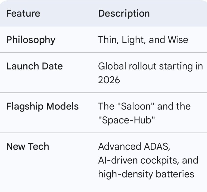
The 0 Series represents a “second founding” for the company. By stripping away the bulk of traditional EV design, Honda aims to prove that electric cars can be both spacious and incredibly aerodynamic.
What the New Symbol Means for Drivers
Beyond the aesthetics, the new branding signals a shift in how Honda builds cars. Here is what “Reinventing the H” means for the consumer:
- Digital-First Design: The new logo is optimized for illuminated grilles and high-resolution digital interfaces.
- Sustainability Focus: The “H” represents a brand striving for carbon neutrality across all products and corporate activities by 2050.
- Human-Centric Mobility: The “outstretched hands” design philosophy emphasizes that tech should serve the human, not the other way around.
Impact on the Automotive Market
Honda is entering a crowded EV space dominated by Tesla and aggressive Chinese manufacturers. Honda’s Bold New Symbol for the Electric Era serves as a vital tool for brand differentiation. It tells the world that Honda isn’t just “electrifying” its current lineup; it is rebuilding its DNA from the ground up.
”We have gone back to basics and formulated the Honda 0 Series with a design for the new era,” said Toshihiro Mibe, Director and President of Honda. “The new H mark symbolizes our determination to undergo a historic transformation.”
Conclusion: A New Chapter Begins
Reinventing a logo is a risky move, but for Honda, it’s a necessary one. The new, borderless “H” captures the spirit of a company that is no longer tethered to the combustion engine. It is sleek, nostalgic yet modern, and perfectly suited for the silent, high-tech roads of tomorrow.